

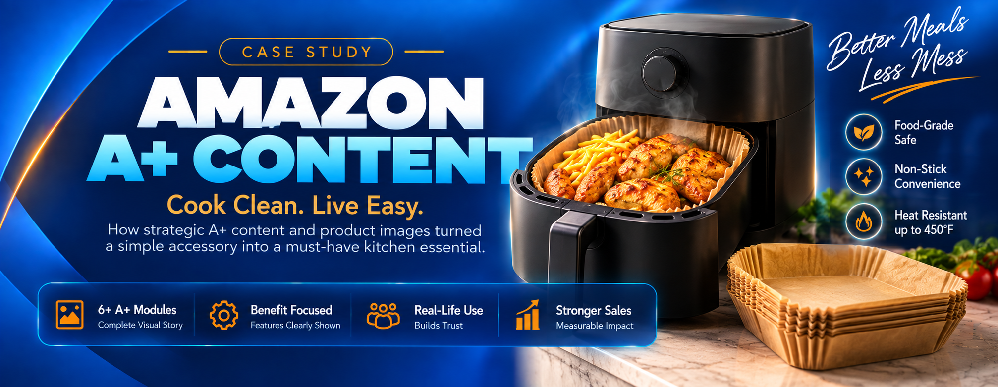
One Product, One Complete Visual Overhaul
The brand had a product that deserved to sell — but a listing that wasn't doing it any favours. The image gallery was thin and unstyled, explaining almost nothing, and below the buy box the page fell back on a plain-text description that shoppers simply scroll past. From the first thumbnail to the last line of the page, nothing was actively persuading anyone to buy.
Fixing only half of that would have left money on the table. Listing images decide whether a shopper clicks and keeps looking; A+ Content decides whether an interested shopper actually commits. So we rebuilt both together, as one connected visual experience across the entire listing.
Listing Images
The gallery shoppers swipe through above the fold — built to win the click and answer the first questions fast.
A+ Content Modules
The brand page below the buy box — built to tell the story, build trust and close the sale.
Where the Old Listing Was Losing Shoppers
The listing was leaking buyers at both ends of the page. These were the gaps the new visuals had to close.
- Images not built for mobile: most shoppers browse on a phone, where small text and busy layouts vanish at thumbnail size.
- Features shown, benefits missing: the old images showed the product but never explained why it mattered to the person buying it.
- A description nobody reads: the space below the buy box was a block of plain text — the exact point where undecided shoppers were left without a reason to stay.
- No brand identity: without a consistent look or brand story, the product blended in with cheaper generic listings around it.
- Two sets of rules: main images and A+ modules each have their own strict Amazon requirements, and breaking either can mean suppression or rejection.
One Visual Story, Top to Bottom
Instead of treating images and A+ Content as two separate jobs, we planned them as one continuous argument. The listing images hook the shopper and answer the quick questions; the A+ Content picks up exactly where they leave off and goes deeper.
- A hero image built for the search grid: the product filling the frame on pure white, standing out as a thumbnail next to every competitor.
- One clear message per frame: every infographic and every A+ module carries a single headline idea, so nothing competes for attention.
- No repetition between sections: the gallery covers what shoppers need at a glance; A+ Content adds the brand story, deeper detail and reassurance — so scrolling down always reveals something new.
- Real-life context: lifestyle scenes in both sections help shoppers judge size and picture the product in their own routine.
- One shared design system: the same colors, typography and layout rules across all 18 visuals, so the whole listing reads as one premium brand.
Amazon Listing Images
The complete image gallery in listing order. Click any image to view it at full size.
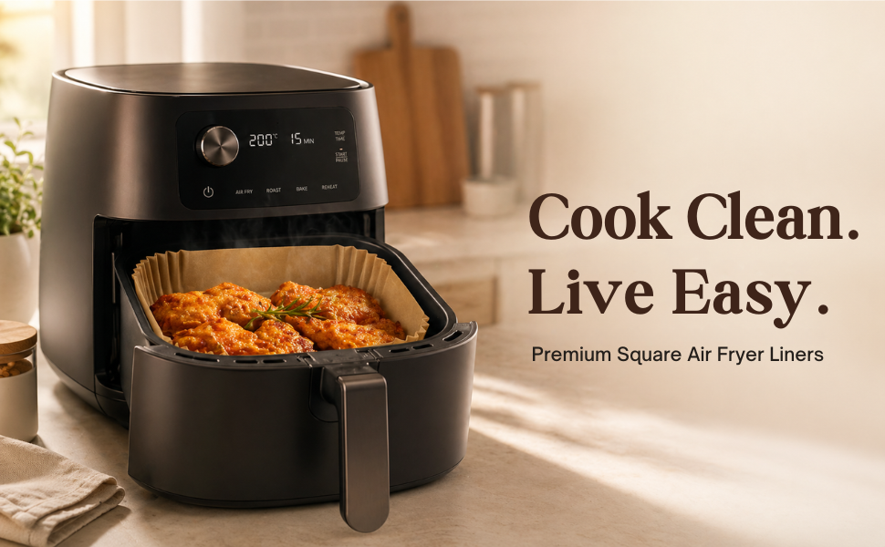
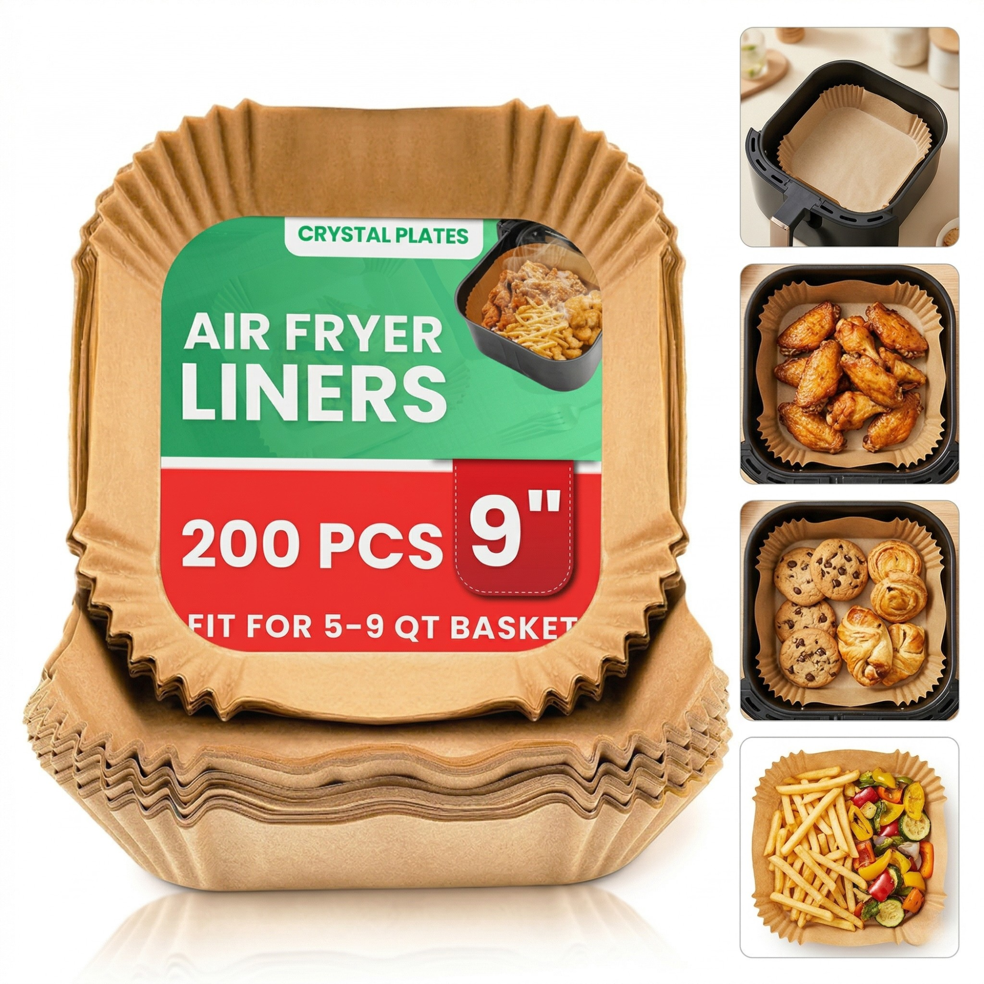
The Thumbnail That Wins the Click
Compliant pure-white hero, sized to stand out in search results.
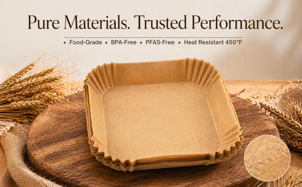
The Product at a Glance
Top features called out clearly, readable on any phone screen.
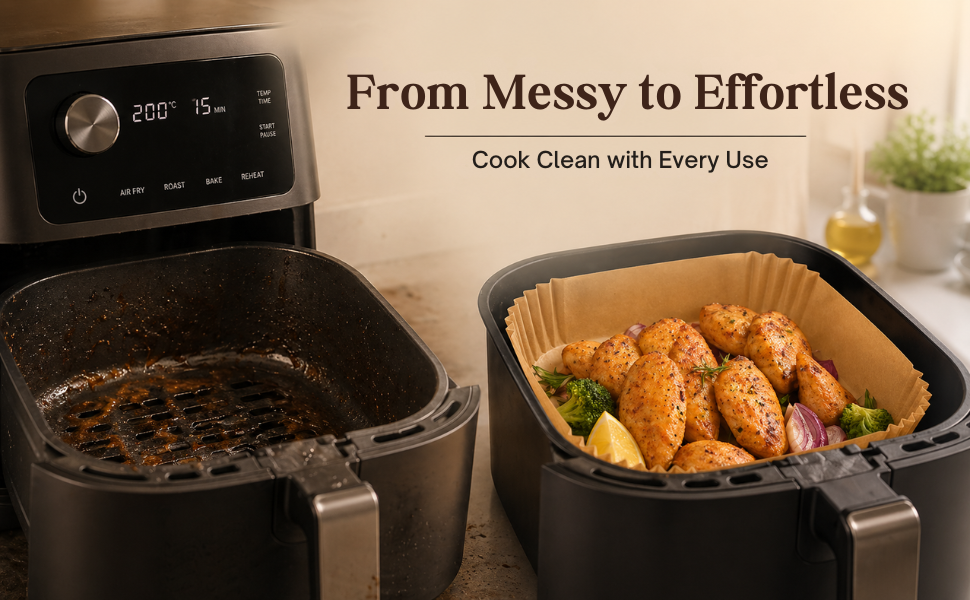
Specs Turned Into Benefits
What each feature actually does for the shopper, in plain words.
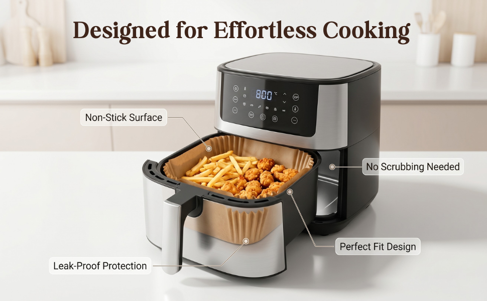
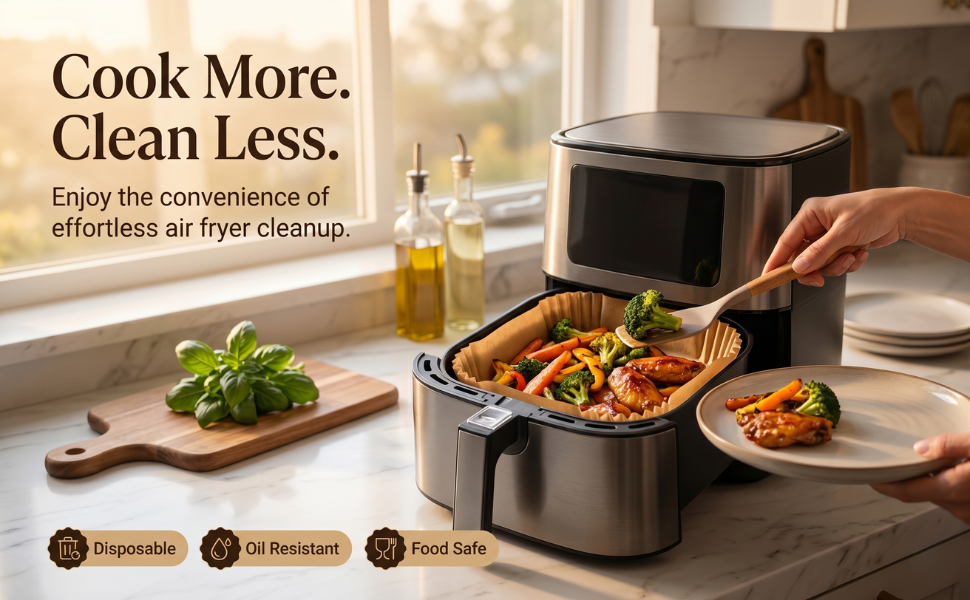
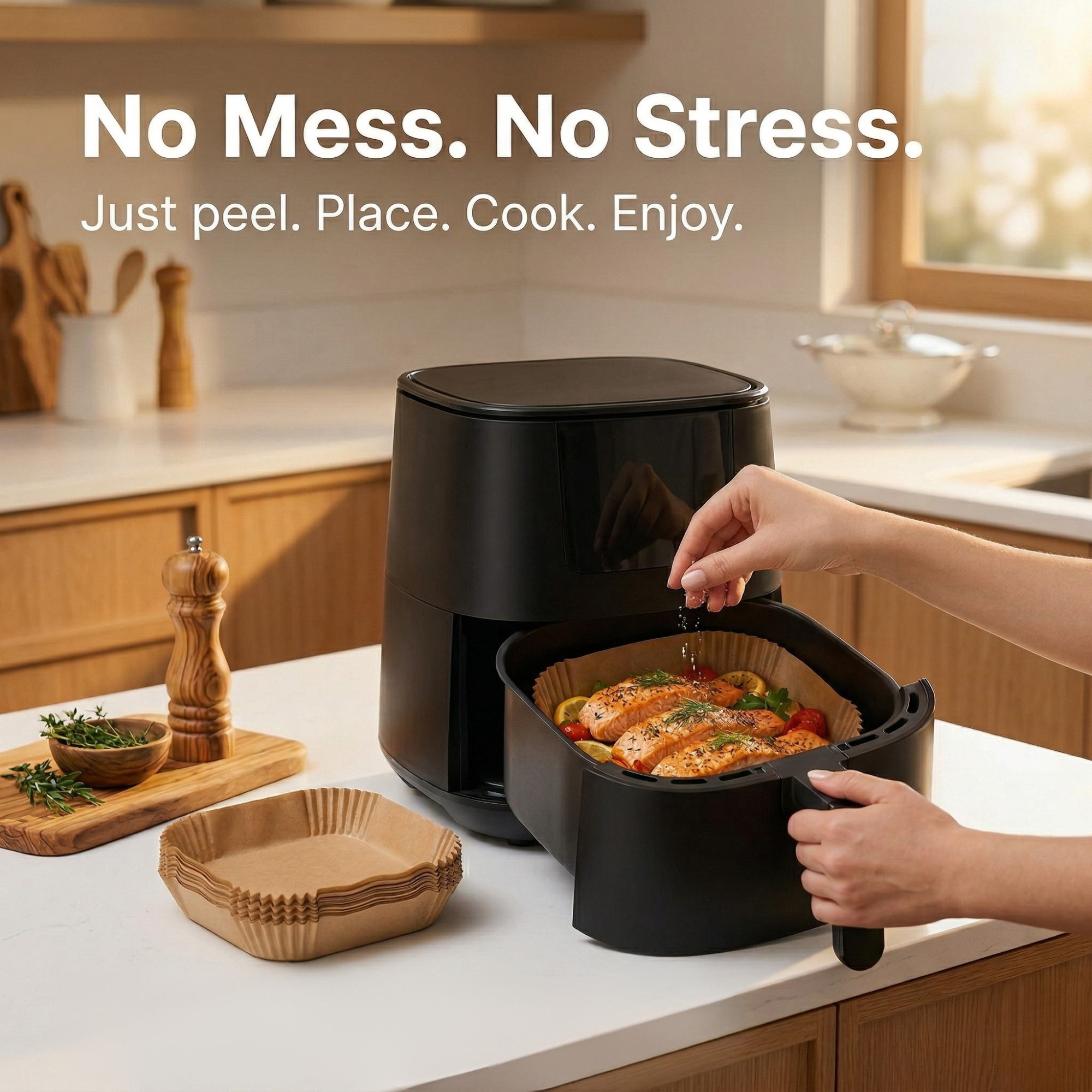
Seen in Real Life
The product in everyday use, so shoppers can picture owning it.
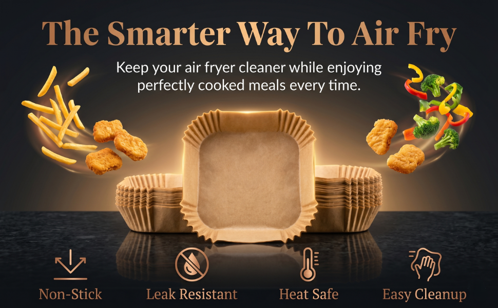
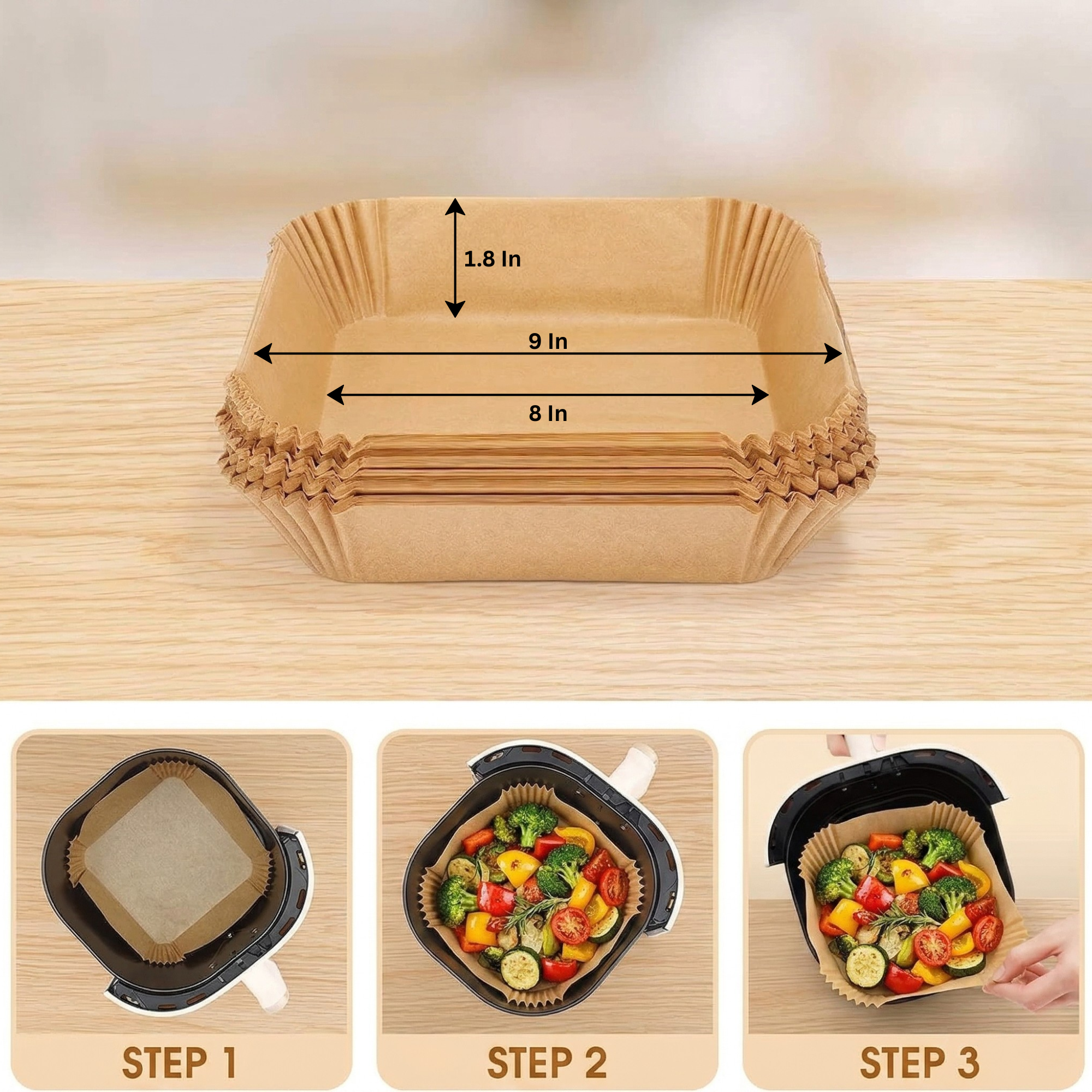
No Guessing on Size
Clear dimensions and scale — the doubt behind most returns.

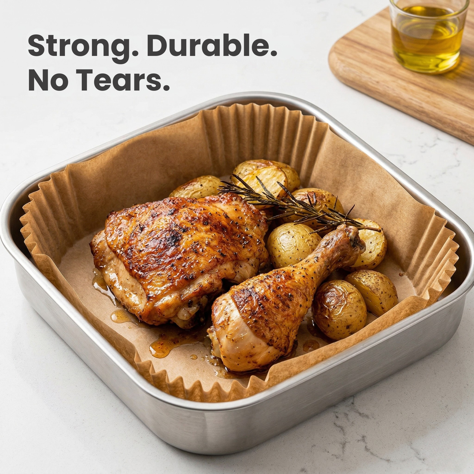
Quality, Up Close
Materials and finish shown in detail to justify the price.
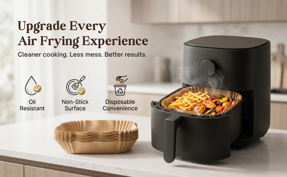
Simple From Day One
Use and setup made obvious, removing any hesitation.
The Last Objection, Answered
The final frame that sends the shopper to Add to Cart.
- Main Image
- Infographics
- Lifestyle
- Size & Scale
- Detail Shots
- Mobile-First Sizing
- Amazon Compliant
Amazon A+ Content
Every module in the order it appears below the buy box. Click any module to view it at full size.
First Impression, Brand First
The opening banner introduces the brand and its promise, setting the tone for everything that follows.
The People Behind the Product
Who the brand is and what it cares about — the trust that separates it from anonymous sellers.
Why It's Worth Buying
The strongest selling points turned into clear visual benefits, with copy that reads at a glance.
The Feature That Sets It Apart
A full module dedicated to the product's standout feature, explained visually and in depth.
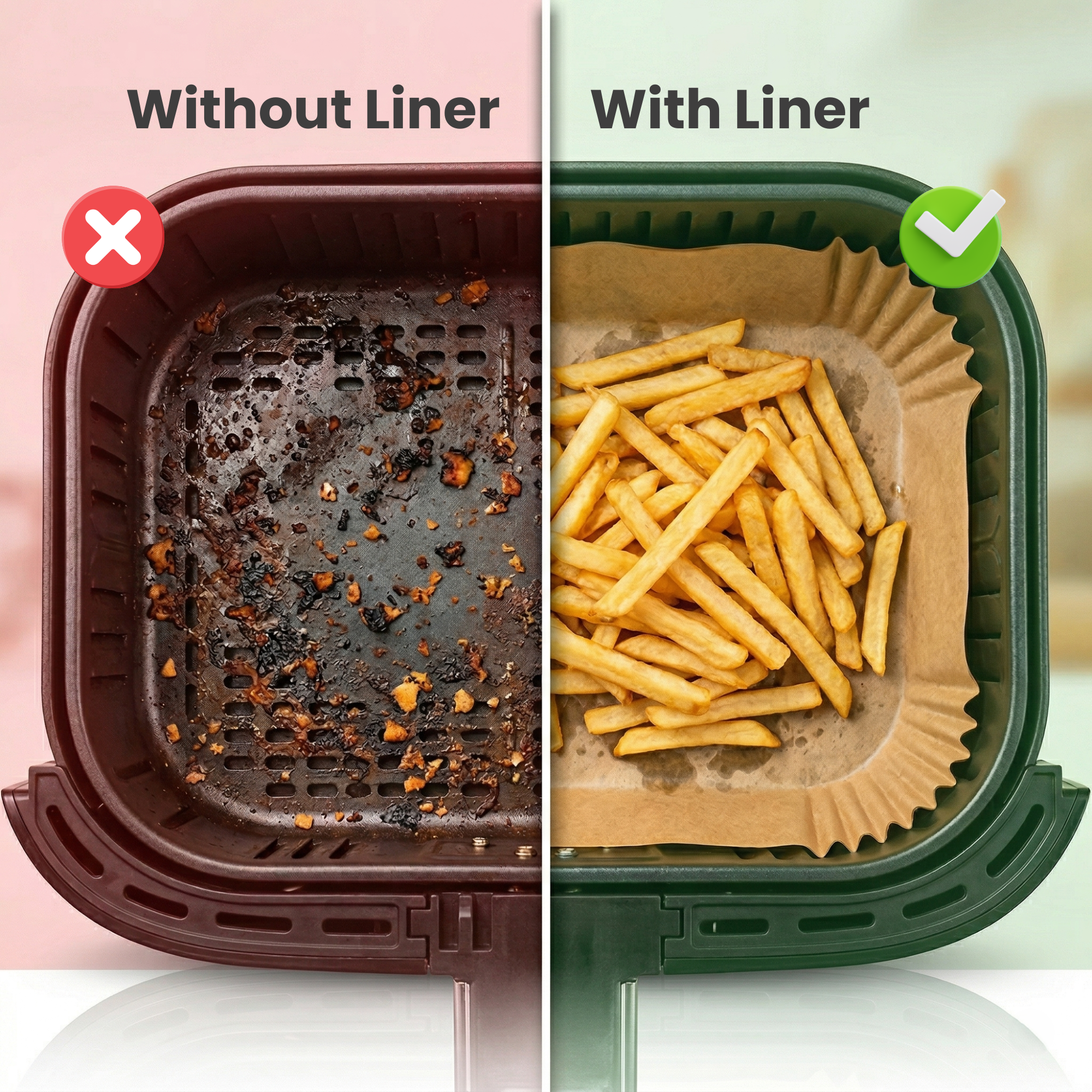
Made for Everyday Life
The product in a real setting, helping shoppers see exactly where it fits into their day.
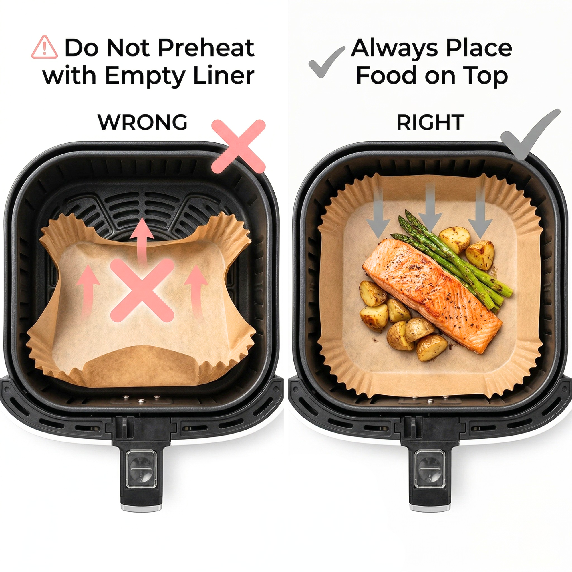
Easy to Understand, Easy to Use
A clear walkthrough of use or setup, so no shopper is left unsure about what happens after delivery.
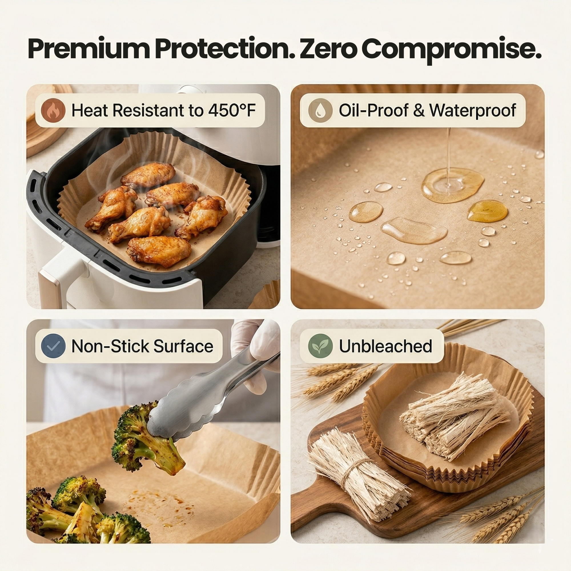
The Details That Build Trust
Materials, finish and build quality shown closely — the proof points that justify the price.

Everything Checked Before Checkout
Key specs and dimensions laid out clearly, answering the practical questions in one place.
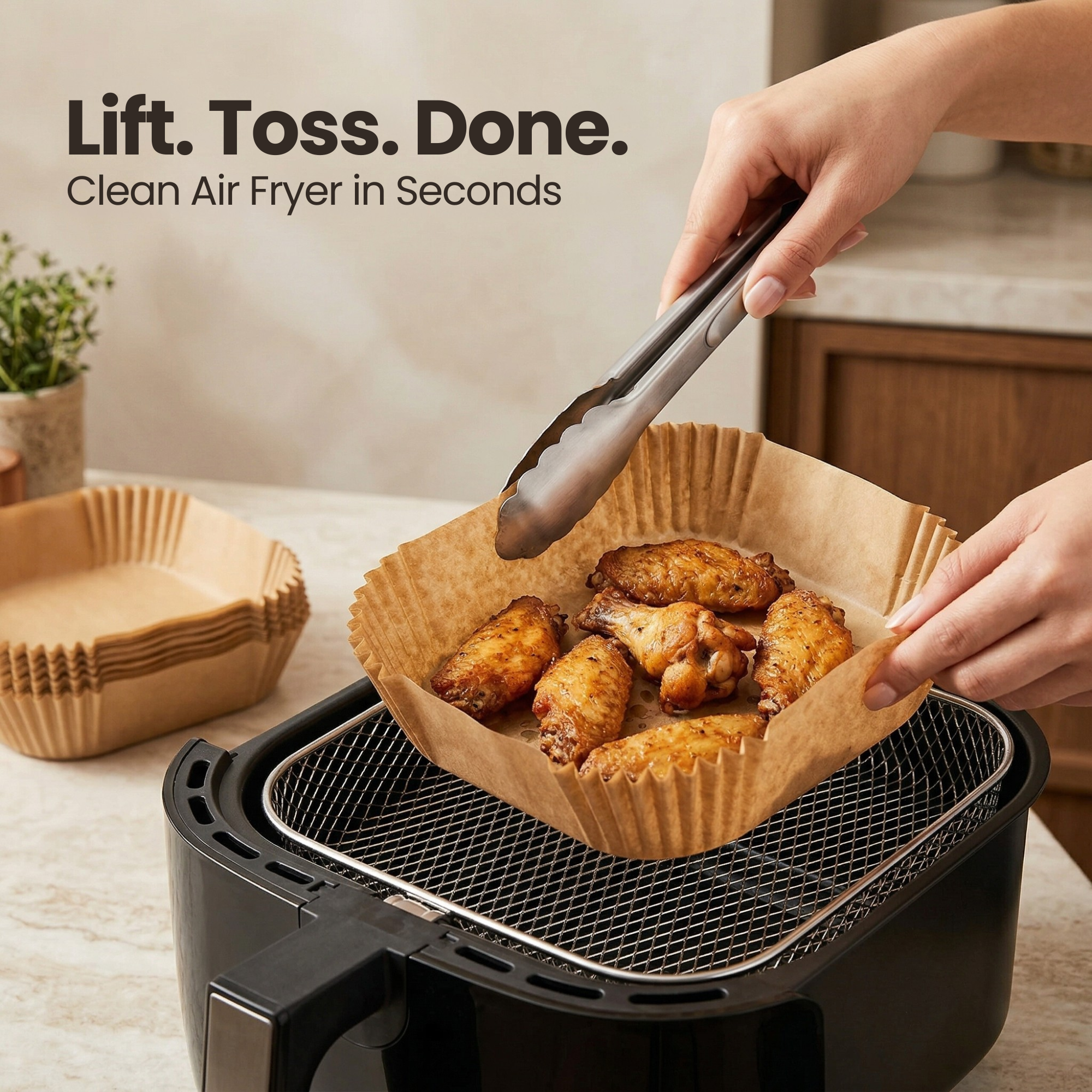
The Reasons to Pick This One
The product's advantages brought together in one module, making the choice feel obvious.
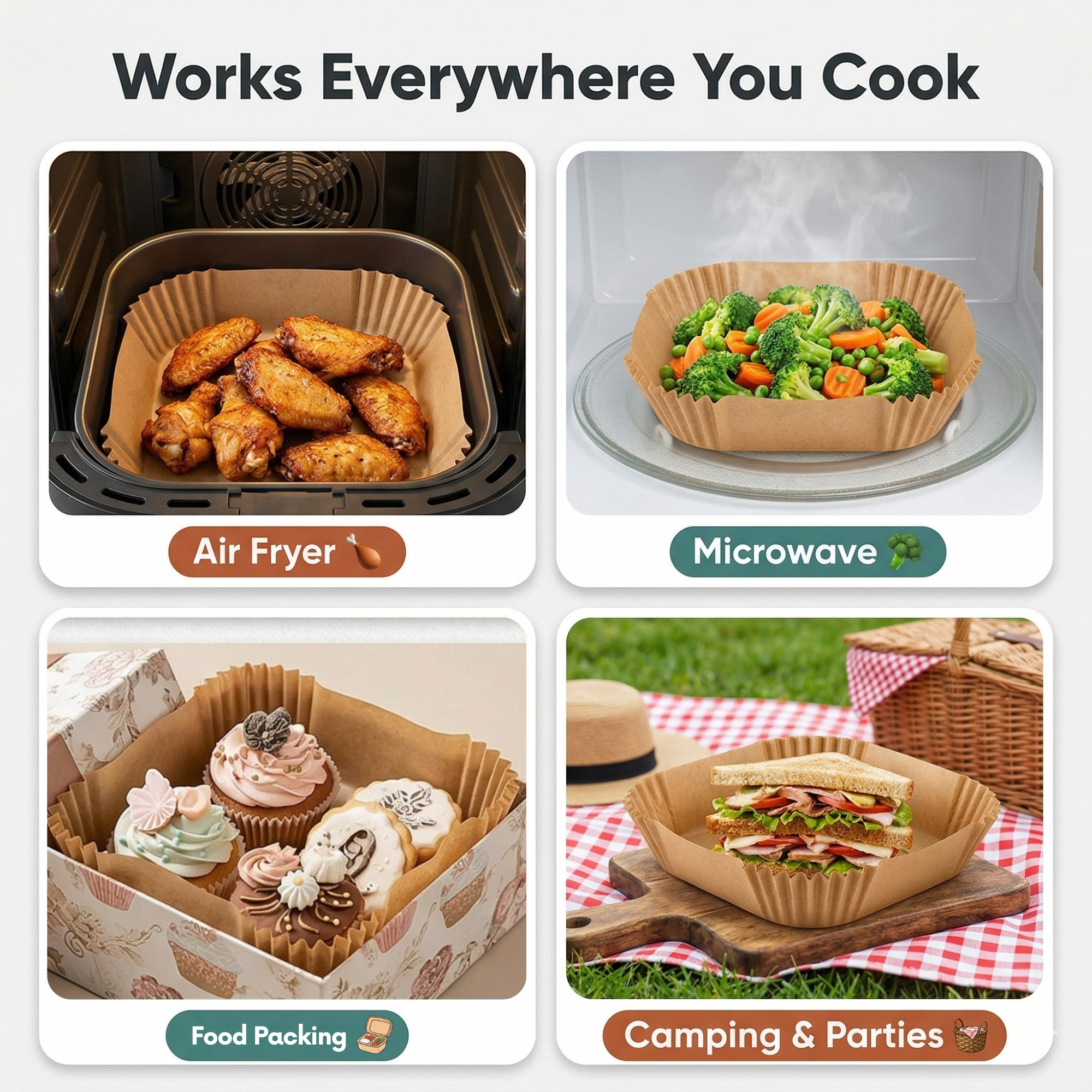
Confidence to Add to Cart
The final module wraps up the story and clears the last hesitation before the shopper buys.
- Brand Story
- Benefit Modules
- Feature Highlights
- Lifestyle
- Specifications
- Mobile-First Layout
- Amazon Approved
Built to Amazon's Rules, Not Around Them
Great visuals are worthless if the listing is suppressed or the A+ Content is rejected. Every file was produced against Amazon's requirements from the start, so everything could go live without resubmissions.
- Compliant main image: pure white background with no added text, borders or watermarks — the rules that get listings suppressed when broken.
- Zoom-ready listing images: square 1:1 files sized well past 1000px, so Amazon's hover-zoom works across the whole gallery.
- Exact A+ module sizes: every module exported at the dimensions Amazon requires, so nothing is stretched or softened on upload.
- Guideline-safe A+ copy: no pricing, discounts, time-sensitive offers, guarantees or competitor references — the usual causes of A+ rejection.
- Mobile-legible text: every overlay sized and contrast-checked at phone size before sign-off.
- Keyword-rich alt text: descriptive alt text written for every A+ module, adding relevant search terms behind the scenes.
How the Full Listing Came Together
Research & Competitor Teardown
Studied top competitors' galleries and A+ Content to map what the category was showing — and the gaps worth owning.
Objection Mapping
Pulled real shopper hesitations from reviews and Q&A, then decided which ones the gallery would answer and which the A+ Content would cover in depth.
Storyboard & Copy
Planned all 18 visuals as one sequence, and wrote short, benefit-led copy for every frame and module.
Design & Brand System
Designed the full set in one shared visual system, so the gallery and A+ Content feel like a single brand experience.
Review, Compliance & Delivery
Checked everything on mobile and desktop, verified it against Amazon's rules, and delivered upload-ready files with alt text.
A Complete, Upload-Ready Listing Package
Listing Images
- Main Hero Image
- Feature Infographics
- Benefit Graphics
- Lifestyle Imagery
- Size & Scale Graphic
- Detail Shots
- How-To-Use Graphic
- Zoom-Ready Export
A+ Content
- Brand Header Banner
- Brand Story Module
- Benefit Modules
- Feature Highlights
- Specification Module
- A+ Copywriting
- SEO Alt Text
- Guideline Compliance Check
Strategy & Files
- Competitor Research
- Objection Mapping
- Full Storyboard
- Mobile Legibility Review
- Source Files
Want a Listing That Sells From Top to Bottom?
From the first thumbnail to the last A+ module, every visual should be doing a job. Let's build yours.
Get Your Listing Designed