

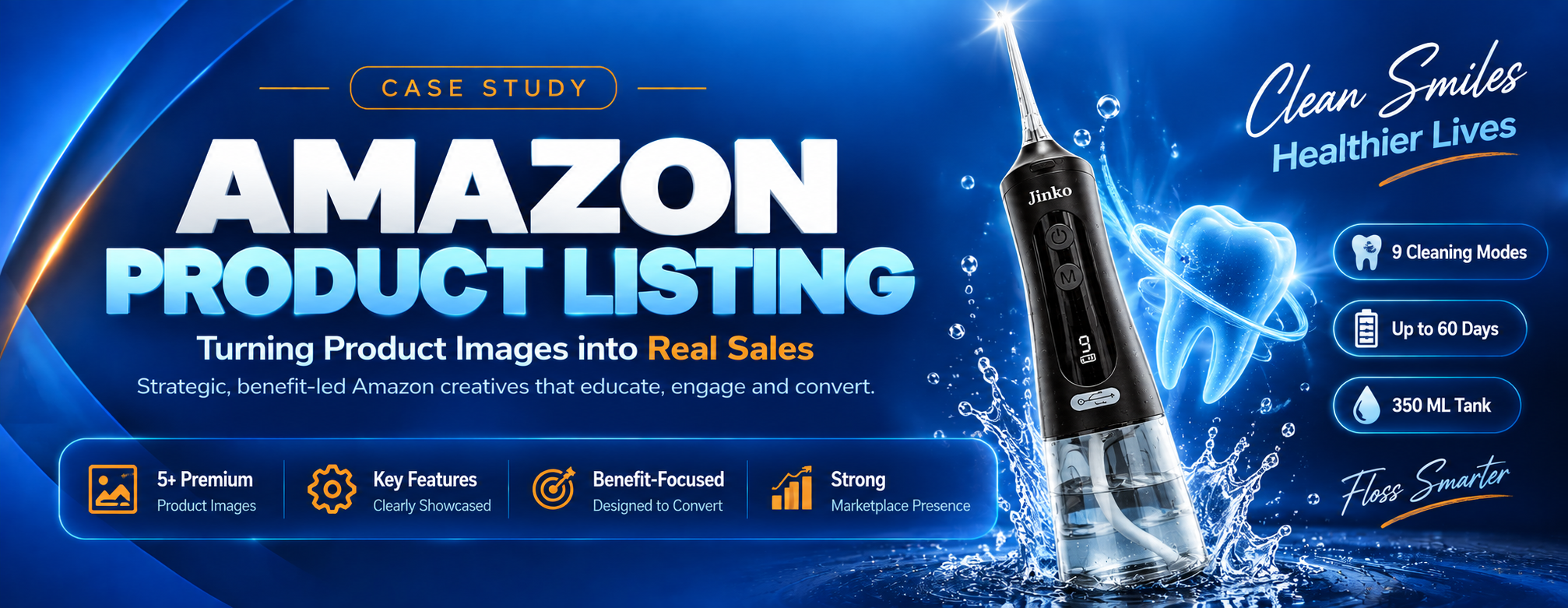
Jinko: A Strong Product Held Back by Weak Images
Jinko came to us with a problem that's far more common than most sellers realise — a product worth buying, sitting behind a listing that gave shoppers no reason to buy it. The gallery was a handful of plain, unstyled shots: no context, no benefit callouts, no sense of scale, and nothing that set the brand apart from the cheaper look-alikes sitting directly beside it in the search results.
On Amazon that gap is expensive. The image stack is the sales page — shoppers swipe through it long before they read a single bullet point, and most buying decisions are made from those few frames alone. Jinko's images weren't making the case for the product; they were simply showing it and hoping the shopper worked the rest out for themselves. Most don't. They scroll on to a competitor whose images already answered their questions.
Why Most Amazon Images Don't Convert
The bar on Amazon is low, which is exactly why good images win so decisively. Jinko's old gallery fell down in the same four ways most listings do.
- Designed for desktop, viewed on mobile: most shoppers see these images as thumbnails on a phone. Fine print and busy layouts simply disappear at that size.
- Features listed, benefits missing: a spec label means nothing to a shopper who doesn't already know the category. The image has to translate the spec into what it does for them.
- No sense of scale: "how big is this actually?" is the single most common pre-purchase doubt — and the most common cause of returns when it goes unanswered.
- Compliance risk: a main image that breaks Amazon's pure-white-background rule can get a listing suppressed outright, no matter how good the design is.
A Frame-by-Frame Conversion Sequence
The gallery is treated as an ordered argument, not a photo album. Each slot is assigned a job before a single pixel is designed, so the set moves the shopper from "what is this?" to "this is the one" in sequence.
- Hero image built for the search grid: the product filling the frame on pure white, readable as a thumbnail against every competitor on the results page.
- One benefit per infographic: a single headline claim per frame, backed by the visual that proves it — never four claims competing for the same attention.
- Lifestyle for context and scale: the product in real use, so the shopper can place it in their own space and size it against something familiar.
- Detail shots that remove doubt: materials, finish, and build quality shown close up, because texture is what a photo can convey and a bullet point can't.
- One consistent visual language: shared type, color, and layout rules across every frame, so the set reads as a brand rather than as seven unrelated files.
The Full Image Set
The complete designed gallery for Jinko, in listing order. Click any image to view it at full size.
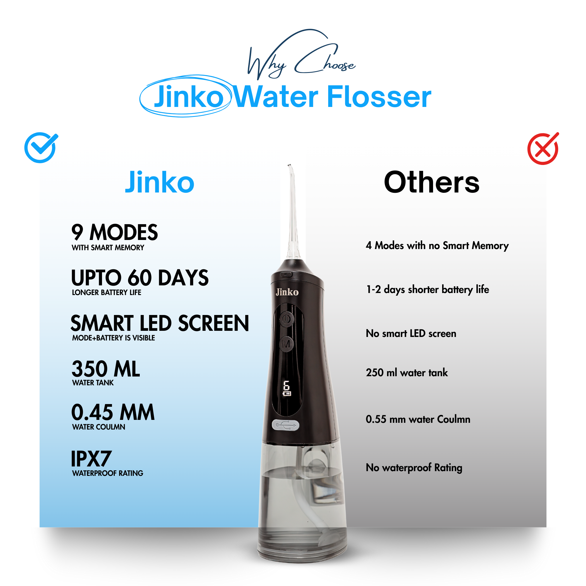
The Thumbnail That Wins the Click
Product filling the frame on a compliant pure-white background — designed to stay legible and distinct at search-result thumbnail size.

Specs Translated Into Benefits
Key features called out directly on the product, with short headline copy sized to stay readable on a phone screen.
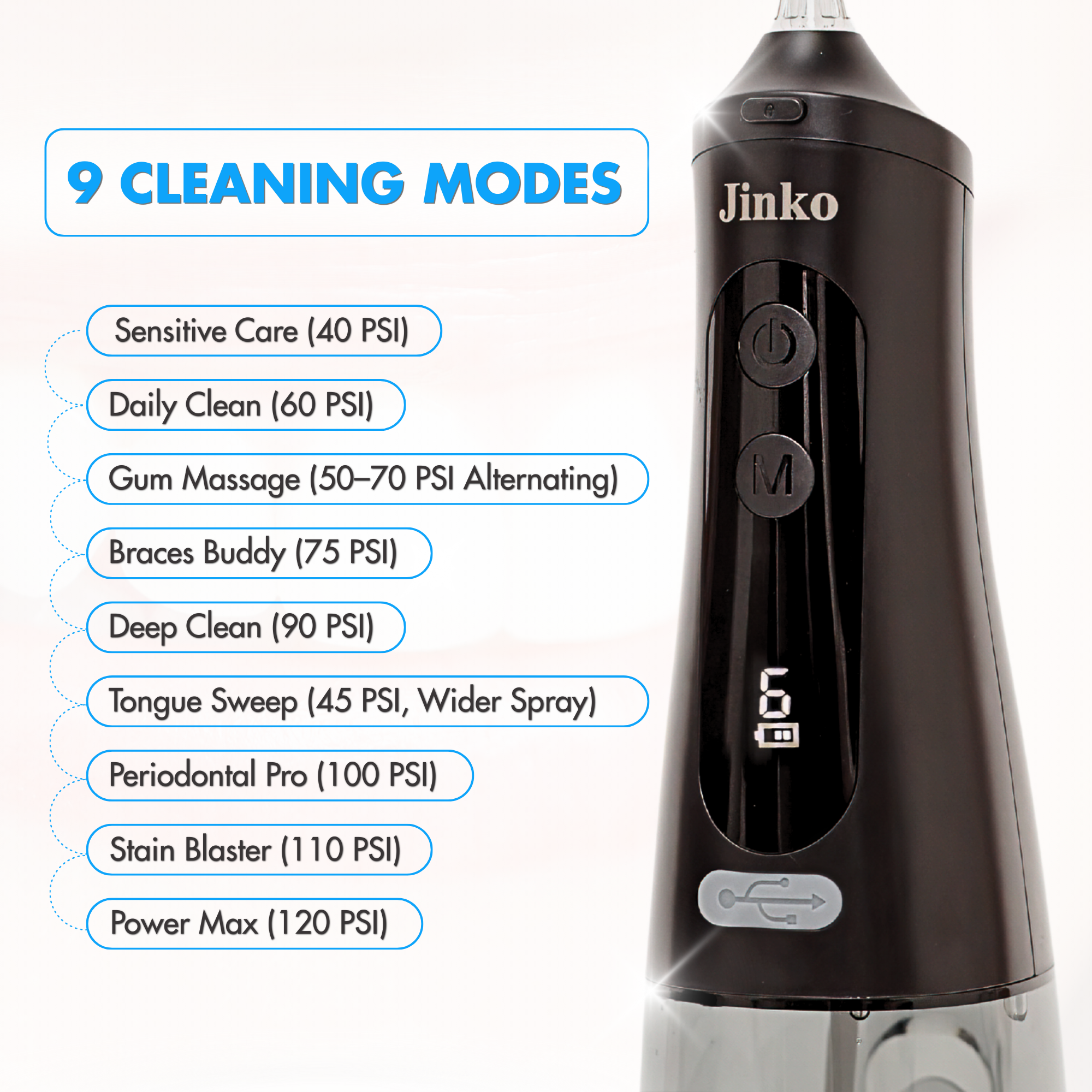
Context and Real-World Scale
The product shown in its natural setting, letting the shopper judge size and imagine it in their own space — the doubt that most often stalls a purchase.

Proof of Quality, Up Close
Materials, finish and construction shown at close range — the evidence that justifies the price and separates the product from cheaper look-alikes.
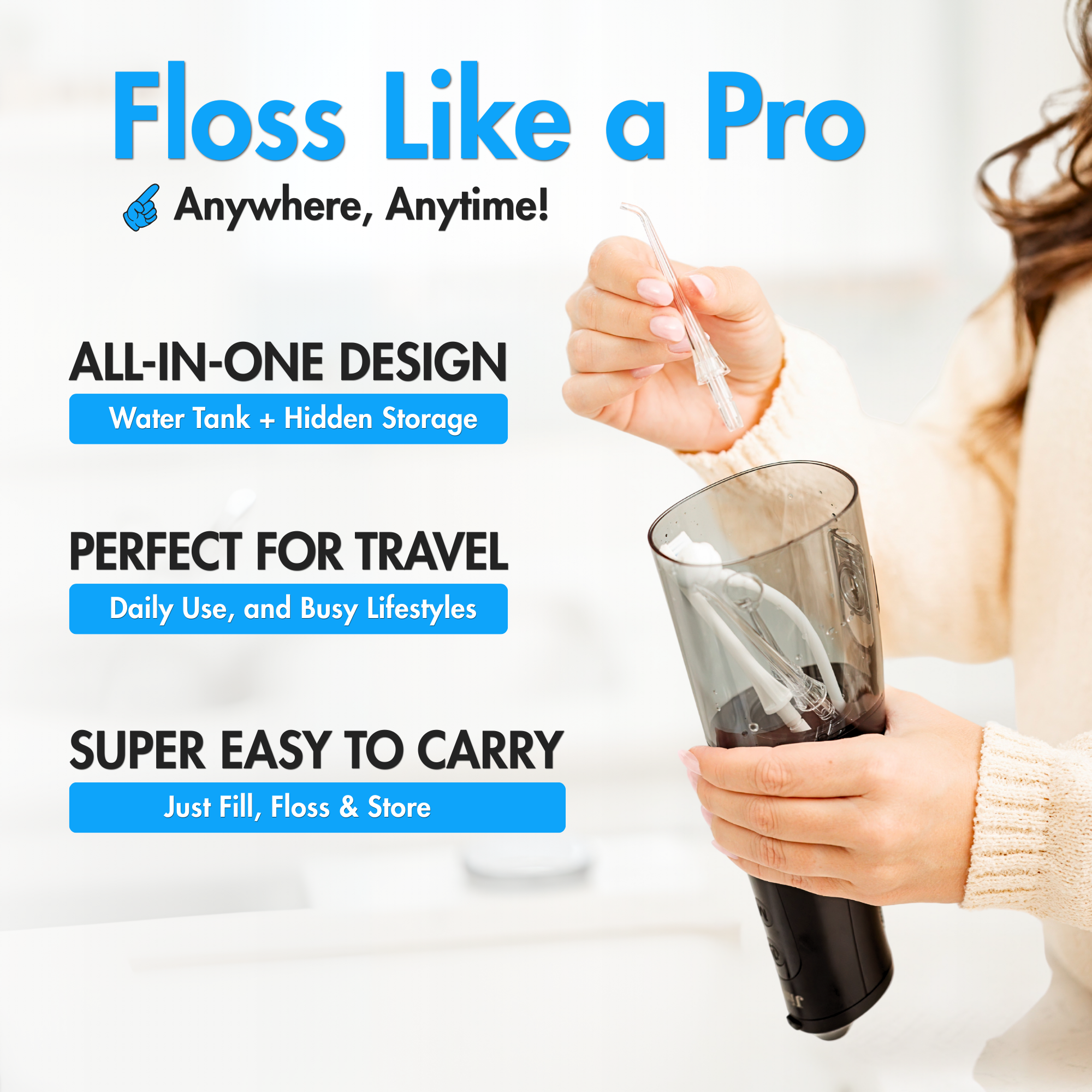
The Last Objection, Answered
The final frame in the sequence — built to clear whatever hesitation is left and send the shopper straight to Add to Cart.
- Main Image
- Infographics
- Lifestyle
- Detail Shots
- Mobile-First Sizing
- Amazon Compliant
- Brand Consistency
Built to Amazon's Rules, Not Around Them
A beautiful image set is worthless if the listing gets suppressed. Every frame was produced against Amazon's technical requirements from the start, so the set could go live without a single rejection or resubmission.
- Zoom-ready resolution: files sized well past the 1000px threshold so Amazon's hover-zoom activates — a feature that measurably lifts engagement and is lost entirely on undersized images.
- Square 1:1 framing: consistent aspect ratio across the set so nothing crops awkwardly between the gallery, search results and mobile app.
- Compliant main image: pure white background, no added text, borders, watermarks or props — the rules that get listings suppressed when broken.
- Mobile-legible typography: every overlay sized and contrast-checked at thumbnail scale before sign-off, not at full size on a designer's monitor.
How the Set Came Together
Research & Competitor Teardown
Studied the top listings in Jinko's category to map what every competitor was showing — and more importantly, what they were all leaving out. The gaps became the angles worth owning.
Objection Mapping
Pulled the real hesitations out of category reviews and Q&A — size, quality, compatibility, durability — and assigned each one to the specific frame that would answer it.
Storyboard & Sequence
Planned the full gallery as an ordered argument before design began, so each frame builds on the last instead of repeating it.
Design, Review & Delivery
Produced every frame to a shared visual system, reviewed each one at thumbnail size on a phone, and delivered Jinko a compliant, upload-ready set.
A Complete, Upload-Ready Image Set
- Competitor Research
- Objection Mapping
- Gallery Storyboard
- Main Hero Image
- Feature Infographics
- Lifestyle Imagery
- Detail & Close-Up Shots
- Copywriting for Overlays
- Mobile Legibility Review
- Amazon Compliance Check
- Zoom-Ready Export
- Source Files
Want Images That Actually Sell Your Product?
Your listing gets one scroll to make its case. Let's make sure every frame in it is doing a job.
Get Your Listing Images